ApolloEd Dashboard Design
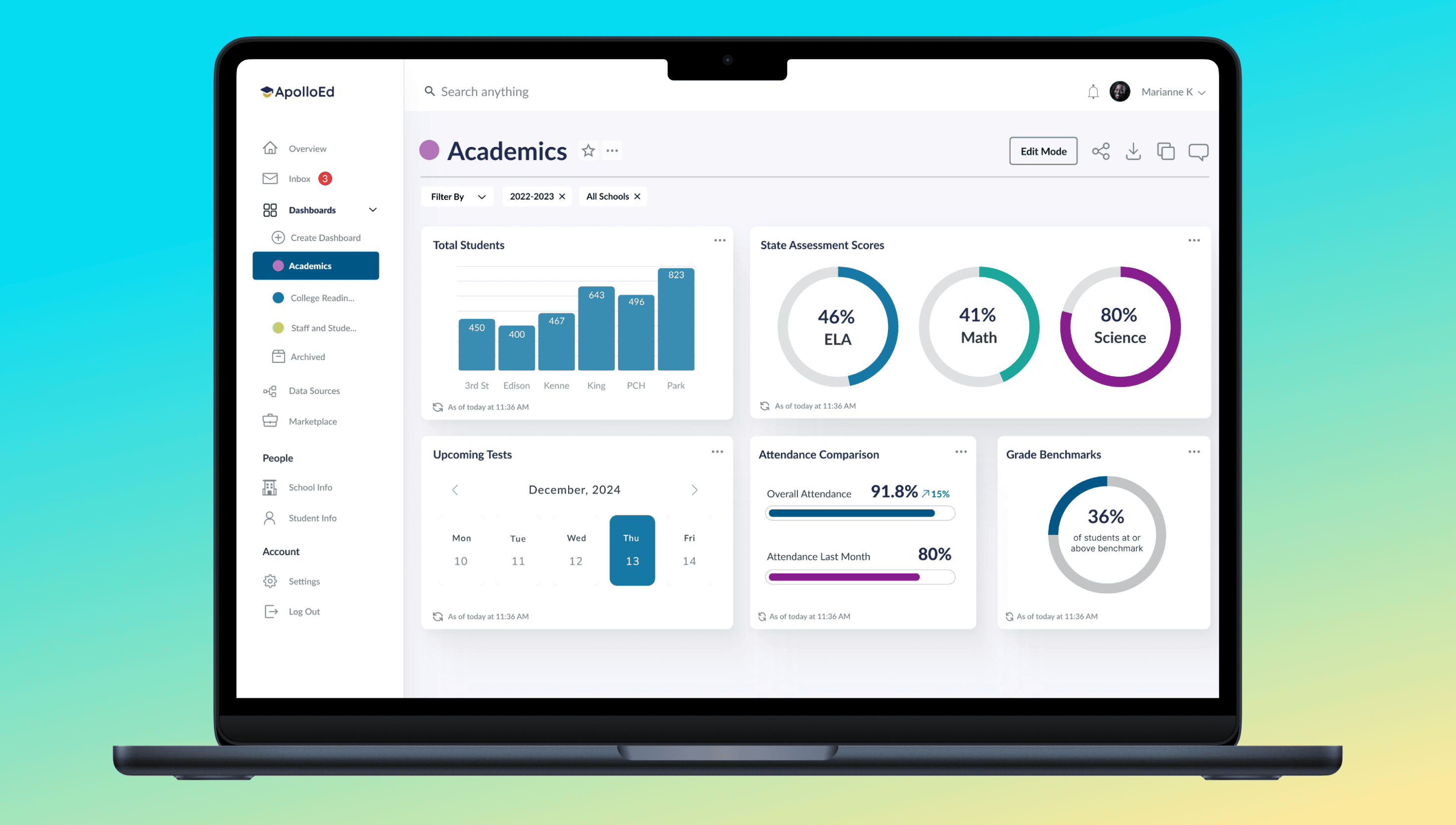
Education leaders are drowning in a sea of disconnected digital tools, struggling to stay afloat as they attempt to track data and manage their ever-growing to-do lists. ApolloEd offers a unique solution by integrating existing applications and streamlining digital workflows into an all-in-one data management and strategic planning dashboard.
Background
50% of ApolloEd's clients were dropping off during onboarding
As the UX Team Lead focused on serving education leaders, I led three designers to research and design a self-service onboarding experience for ApolloEd’s educational data management dashboard. Our goal was threefold: to engage education leaders with a seamless and intuitive process, reduce onboarding time to under 10 minutes, and elevate the customer satisfaction score to a 4/5 rating.
The Solution
A Tailored Onboarding Experience for Education Leaders
Prior to the self-service dashboard, ApolloEd built custom dashboards for independent school districts, which could take up to 2 months of development time.
Our self-service onboarding flow dramatically decreased onboarding time and improved educators' and charter school leaders' experience.
By streamlining the onboarding journey, we aimed to empower educators to focus on what matters most—improving data-driven decision-making and fostering a stronger data culture within their institutions.
2:46min
from 6-8 weeks of onboarding
4.13/5
from 3.8 Customer Satisfaction Score
6 screens
from 13 screens before user can access their dashboard
• Instant self-service onboarding process
• Ability to create and edit a dashboard within 6 steps
• Accessible help bot pop-up that houses resources, as well as provides recommendations to improve data strategy
• "Anonymize Sensitive Data" feature allows users to focus on the data and instills confidence in sharing to increase productive and constructive discussions
• Invite teammates and share dashboards
• A variety of role-based dashboard layouts available to use, centered around each role’s interests
• Ability to aggregate sample data, so they can instantly create and bypass the data agreement contract, a current onboarding legal requirement and obstacle
“This is too easy! Just to say bluntly, I just created a dashboard in three clicks here.
And that’s awesome when it takes me, you know, two hours to create a dashboard, and I love that there’s a lot of stock default ones ready to go.”
User Participation
Executive Director of Data & Technology
Discovery
Important industry trends discovered
After the project introduction phase, I conducted secondary research to understand the edtech landscape, and discovered two major trends:
Increasing concerns of cyberattacks on personal and private data of students
• A data agreement contract allows ApolloEd to store their clients’ sensitive school information on their application
Education leaders are the most active “shoppers” or advocates of new instructional technology at their institutions
• They far outnumber their supervisors, but only their supervisors can finalize business relationships
• The data agreement contract process takes about 1 one week
Standing above the competition without required consultation requests
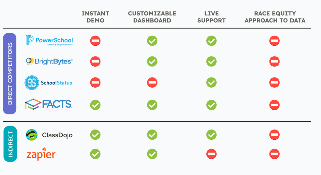
Most direct companies require scheduling consultation prior to allowing users to see their product. From the edtech landscape research, we identified five direct competitors and 2 indirect competitors. We had limitations to fully testing competitors’ products due to the required consultation requests, so I opted for a summarized high-level view of each company.
The new self-service onboarding, as well as our client’s unique approach to considering racial equity when creating and digesting data visualizations, would make them stand out in the crowd. Custom features means investing time in discovering custom needs.
User Research
How do we empower education leaders during the onboarding process?
We interviewed 5 ApolloEd users who are leaders in various departments. Our goal was to learn about their needs, their current frustrations with onboarding, and new opportunities.
• What problem is ApolloEd currently solving, and how is that benefiting you?
• What is the process of getting ApolloEd approved by your supervisor to use officially?
• How was the setup and training process and how long did it take?
• What are your likes and dislikes of the current dashboard, and what would you like to add?
Main Themes and Insights
After synthesizing our data through affinity mapping, we discovered the current onboarding process is inconsistent. Dashboard development can take anywhere from 3 to 12 months. Education leaders see the immense value of improved data strategy and culture for their teams, but they are afraid to share access to their dashboards.
Personas
The Renaissance Charter School Leader
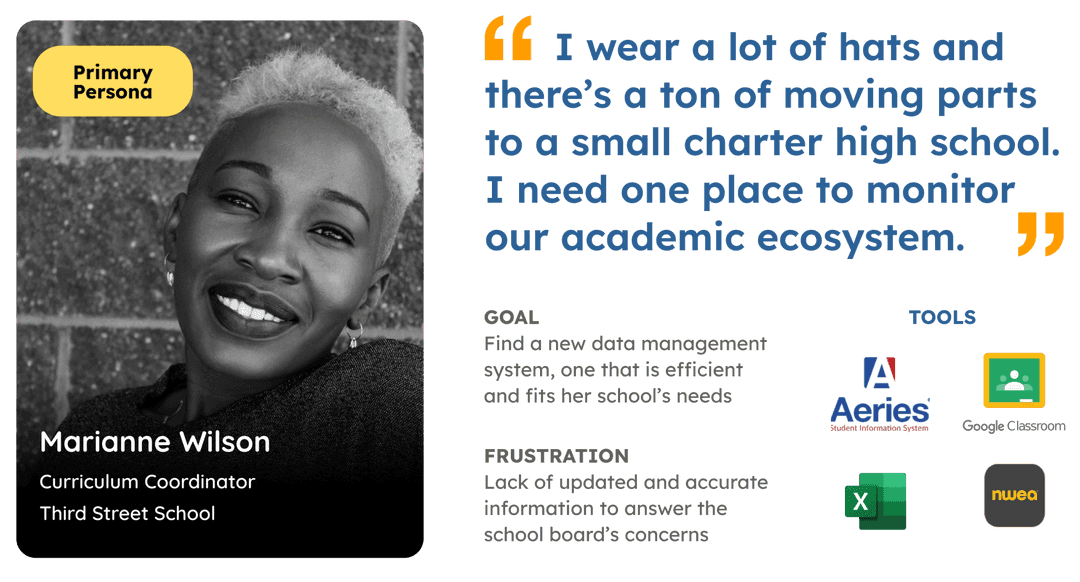
Schools come in all shapes and sizes, but our client’s current customer base is rooted in charter schools with limited staff. I created two personas to show our primary and secondary user. The primary user, Marianne, has an academic focus but also fills multiple roles, and our secondary user, an administrator role such as a specific department or HR lead.
Marianne's Journey
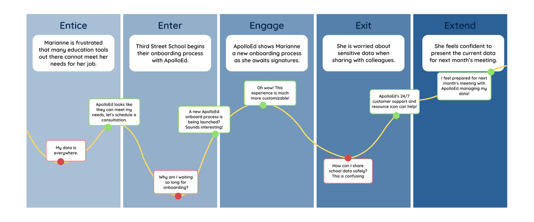
We used the 5 E's method to create Marianne’s journey map for onboarding, which helped us understand each phase in her journey and what were the emotions and opportunities for each.
Define
How might we...
… design an onboarding experience to give busy educational leaders more control and influence, so they can empower their team to make data-driven decisions?
User Flows
Empowering education leaders, one user flow at a time
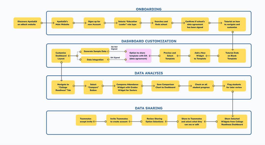
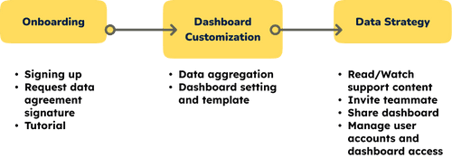
Based on our results from the user research, along with our persona and preliminary design direction discussions, we created a preliminary user flow map in Whimsical with 4 main task flows: Onboarding, Dashboard Customization, Data Analysis, and Sharing.
Usability Testing
Finding: Users Need More Control Over Dashboard Layout
We tested 5 participants, 4 of which were school leaders and one was an educator. After analyzing the data using an affinity map, we were able to procure our successful KPI results of decreasing the onboarding time and increased CSAT scores. Additionally, we found 3 main takeaways to support our iteration process.
More Universal Icons
Reduces cognitive load for users learning a new dashboard system
Better Visual Hierarchy
Prevents confusion moments, especially when call-to-action statements are prominent
Descriptive UX Writing
Supports seamless navigation, users comprehend how and why they arrived on a screen
Site Architecture
Site mapping for success
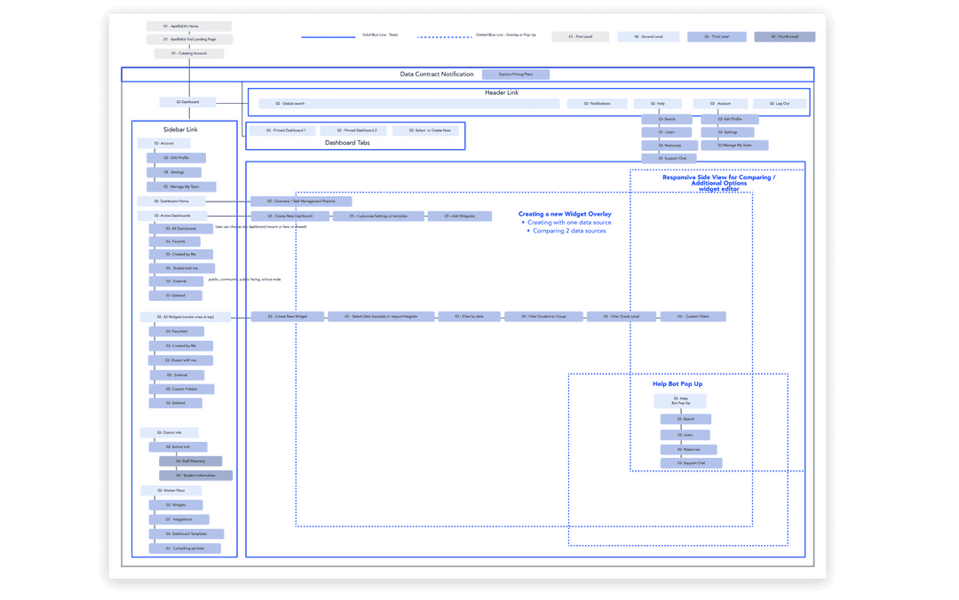
After doing a tree test and card sorting survey that didn't give me conclusive results, I started to brainstorm about navigation. I began to take inventory of all ApolloEd's various types of content to gain a comprehensive understanding. I created a site map to understand and visualize how these pieces could possibly connect. This included the size of titles and subtitles, what appears first on the screens, etc. I created a hierarchy scale of four levels and color-coded the site map to help visualize their impact. This was a great way to start seeing the site on a larger scale and a way to communicate with the team, especially before the style guide was developed.
Feature Prioritization
Trimming down towards the finish line
• Removing features that didn’t work due to legal issues (such as student progress tracking)
• Expediting the onboarding creation to account sign up process, instead of after the tutorial
• Agreeing on final user task flows
Final Design
Onboarding shouldn't be a boring survey
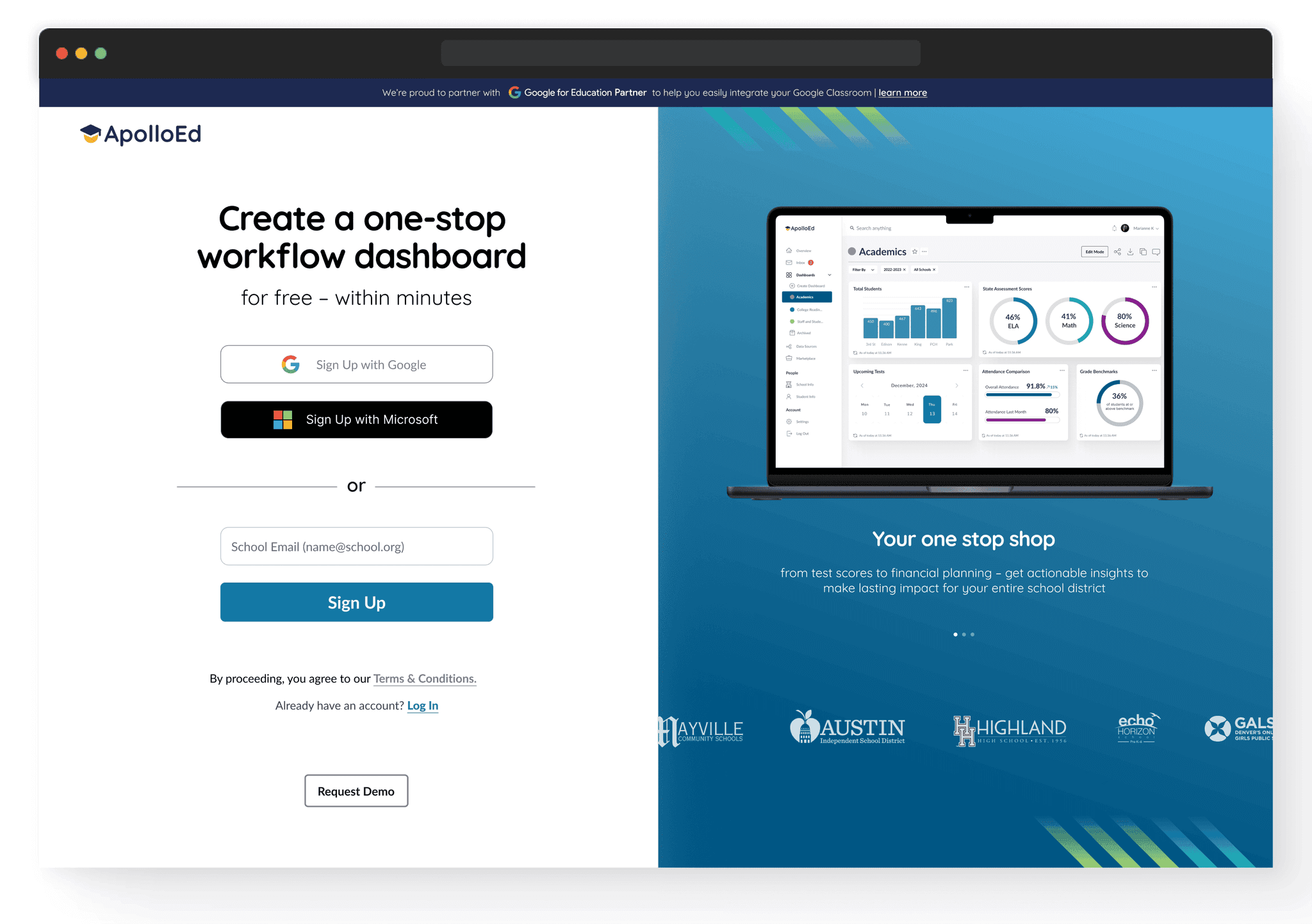
We encountered a challenge when conducting the usability test: participants who had already gone through the client's current onboarding process and had access to their dashboard had difficulty viewing the website from the perspective of a new user. Adding a landing page provides potential new clients with context about the solutions offered, sets her expectations, and lets her know she has the power to create for free, instantly.
Onboarding - Before
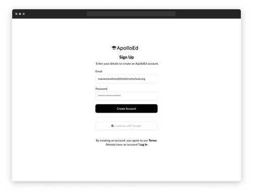
• Sign up starts immediately from client’s company website
• No progress indicators
• 13 screens before being able to create and customize dashboard
• Does not request education leader’s department for more personalization
Onboarding - Mid-fidelity
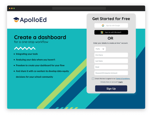
• Landing page with listed features with three ways to register along with strong call-to-action
• Progress indicators to manage expectations
• Only 6 screens before being able to create and customize dashboard
• Dashboard creation process is embedded into onboarding rather than after tutorial
Onboarding - Final Hi-fidelity
Data Connection Widget
Finding the right dash of aggregation
Building a dashboard is like organizing a kitchen pantry. There isn't a perfect, one-size-fits-all template. You have to consider who is using the kitchen and what capacity they are using it for. If all the spices are in a different language, it's very easy to mistake sugar and salt. What’s Marianne’s language?
Aggregation - Before
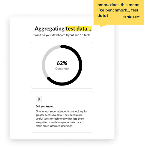
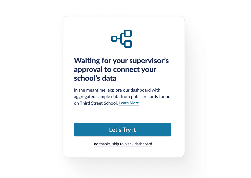
"Test data" is confusing terminology for educators Not enough context information
Aggregation - After
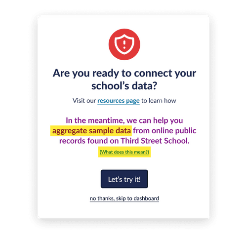
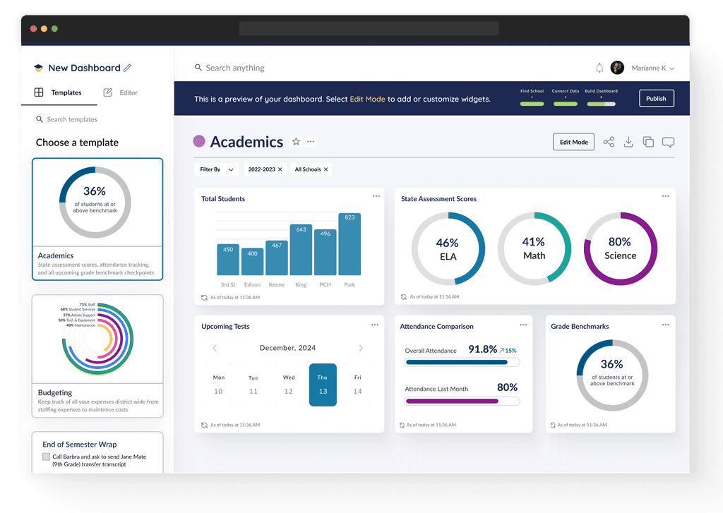
"Test data" is replaced with "sample data" Resource links are provided for context and prominent call-to-action to learn how to integrate Third Street school data Marianne has the control to skip aggregation
Before
Dashboad Customization
After Tutorial
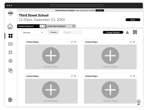
• User starts on a blank template and can click the plus icon to add a widget
Data Aggregation
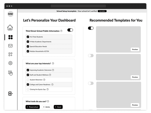
Customization
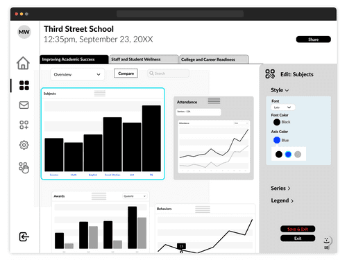
• Customizing the look and feel is isolated to widgets versus entire dashboard
• Dashboard tab system is not scaleable
After
Dashboad Customization
After Tutorial
• Marianne starts on an academic template which matches what she created during the onboarding process
Data
• Data aggregation is automated and provides more context
Customization
• Customization is separated for dashboard and widget
• Edit mode is clearly labeled, versus the less universally known icon we used previously
Final Design: Fostering data culture to be more manageable and secure
In our research, all our participants recognized that a data dashboard can improve their strategic plans and provide a point of discussion to increase their data strategy. Marianne wants to empower department leads to collaborate more and make data-driven decisions. To do this, we needed to design a sharing process that instills confidence in knowing who is seeing which dashboards, and provide reliable help and support for Marianne to master the tools of the dashboard.
Sharing - Before
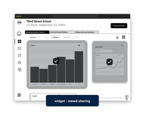
• Widget-based sharing is overly complicated with the many possible combinations of dashboard access
• Lesser known “eye” icon for indicating what is seen or hidden from others
• Share button location was confusing
Sharing - After
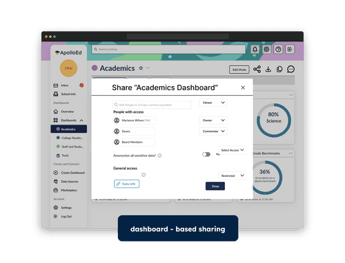
• Dashboard-based sharing increases scalability and access management
• More universally known “share” icon
• Helpbot is easily accessible
• More information icons provide more context and linked resources
Wrapping it up…
I presented solutions for the final presentation to the client and successfully executed a design handoff through Zeplin. The CEO and engineer was particularly excited about the “anonymize sensitive data” feature and the landing page.
“The landing page was really beautiful and it set the tone for the rest of the presentation... the anonymize data feature was definitely helpful for us to consider how to do that..."
CEO
ApolloEd
Further Opportunities
Reflecting on the project, these are recommendations for future designs:
More testing and research on the "anonymize sensitive data" feature
What does anonymizing data look like? Can users blur out certain information for downloading or printing? Can anonymizing data destigmatize the process of teacher evaluations?
Compare Feature
This was requested by multiple users directly. We built and tested this feature in our first mid-fi iteration, which users appreciated. While comparing data can be done through the filtering process, creating a dedicated action button could encourage users to continue and normalize the practice of finding trends, increasing the data culture at that institution.
Sharing, end-user experience
Explore what the end-user experience for people who receive shared dashboards. Where do they get updates from shared dashboards? How do they communicate about the dashboards?
I'm really grateful for this opportunity to work in the interest of school leaders and educators, along with a passionate and mission driven development team. My biggest takeaway is that instilling trust among stakholders, educators and parents is incredibly important, in every stage of onboarding.


